ABOUT THE PROJECT
Over & Over
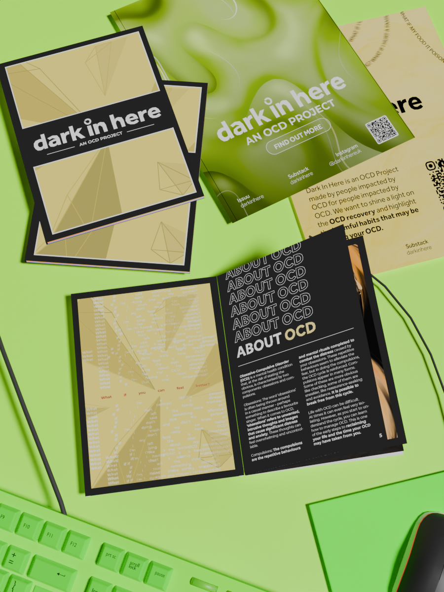
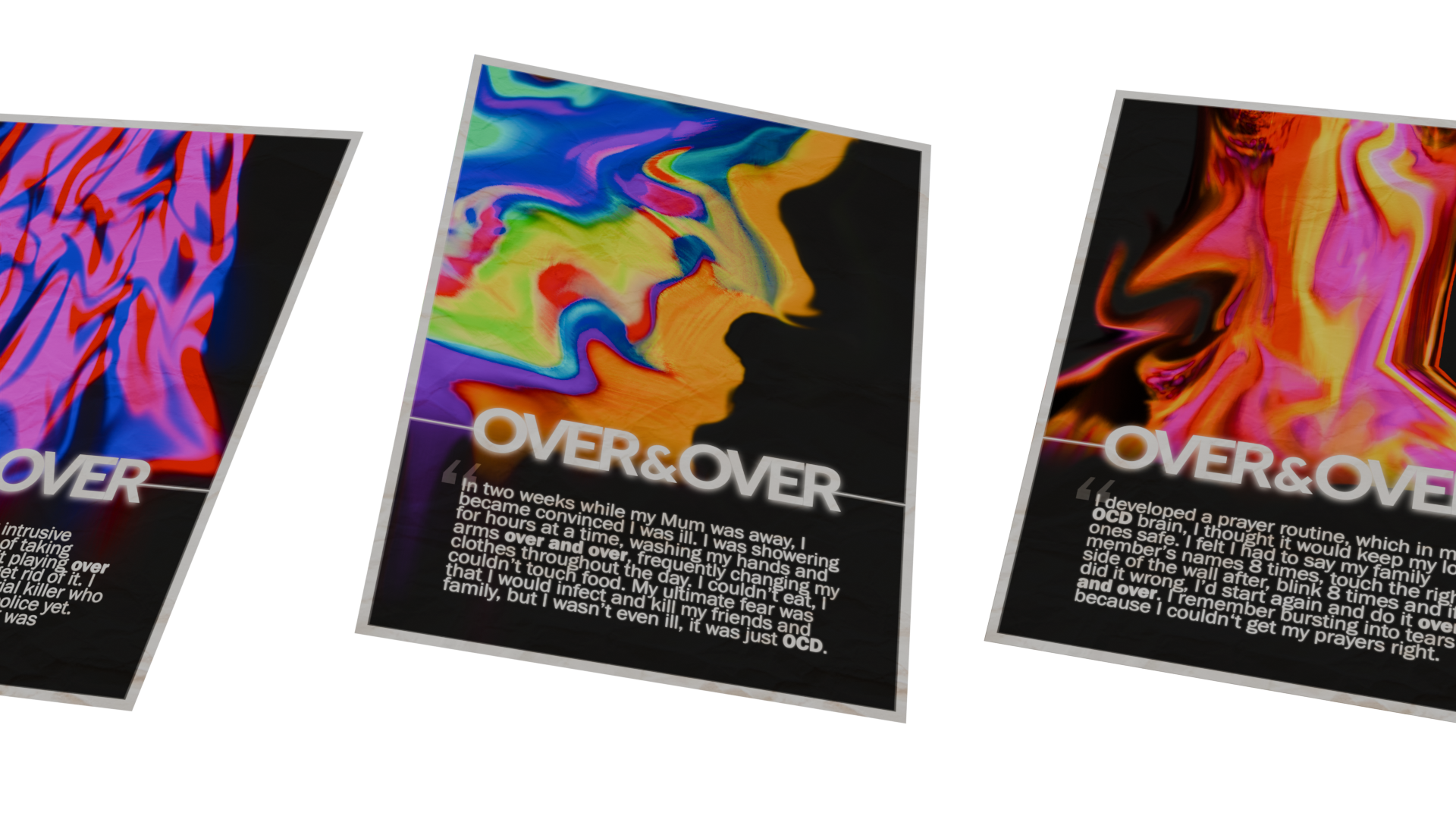
With a myriad of OCD misconceptions and stereotypes circling popular media, the task was to produce a series of posters that challenged misrepresentations in a bid to reduce the 17-year average wait for a diagnosis. This project blended academic research, authentic storytelling and visual communication.
Solution?
Challenge stereotypical notions of neatness and organisation by placing lived experiences at the heart of the project. The posters used indistinct, but vaguely recognisable patterns and vibrant colours to capture attention, whilst a bold sans-serif typeface completed the campaign's visual identity, boosting recognisability. These striking visuals—either captured in a long-exposure shoot or illustrated—were able to direct readers towards realistic representations of OCD and for some, acted as a first step towards accessing professional support.
TOOLS: Adobe Lightroom, Adobe Photoshop, Adobe Illustrator, Adobe InDesign, Premiere Pro, After Effects, Blender.
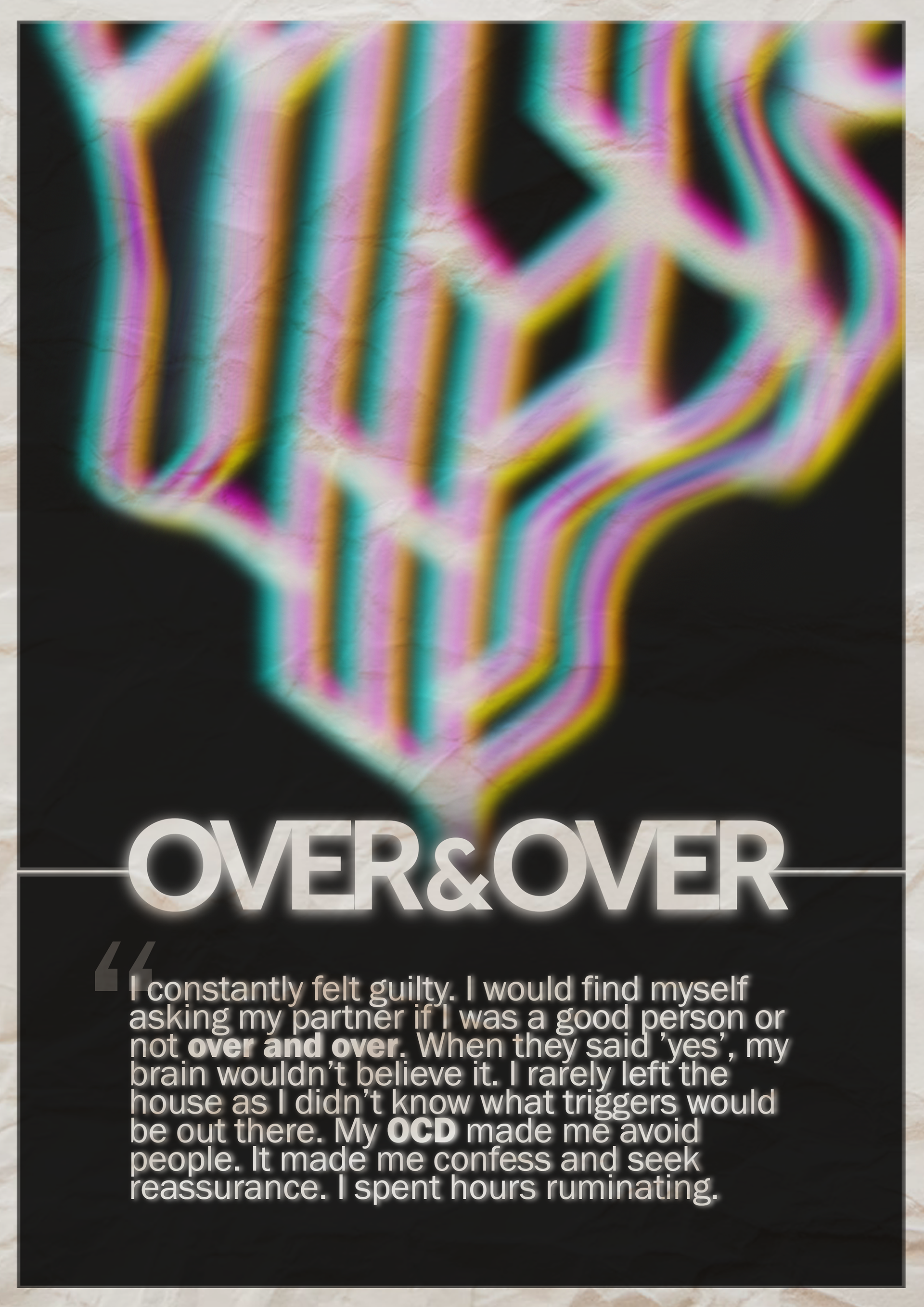
An illustration of neural pathways warped and layered in white, blue, pink and yellow..
A smudged and blurred abstract yellow, red and pink pattern.
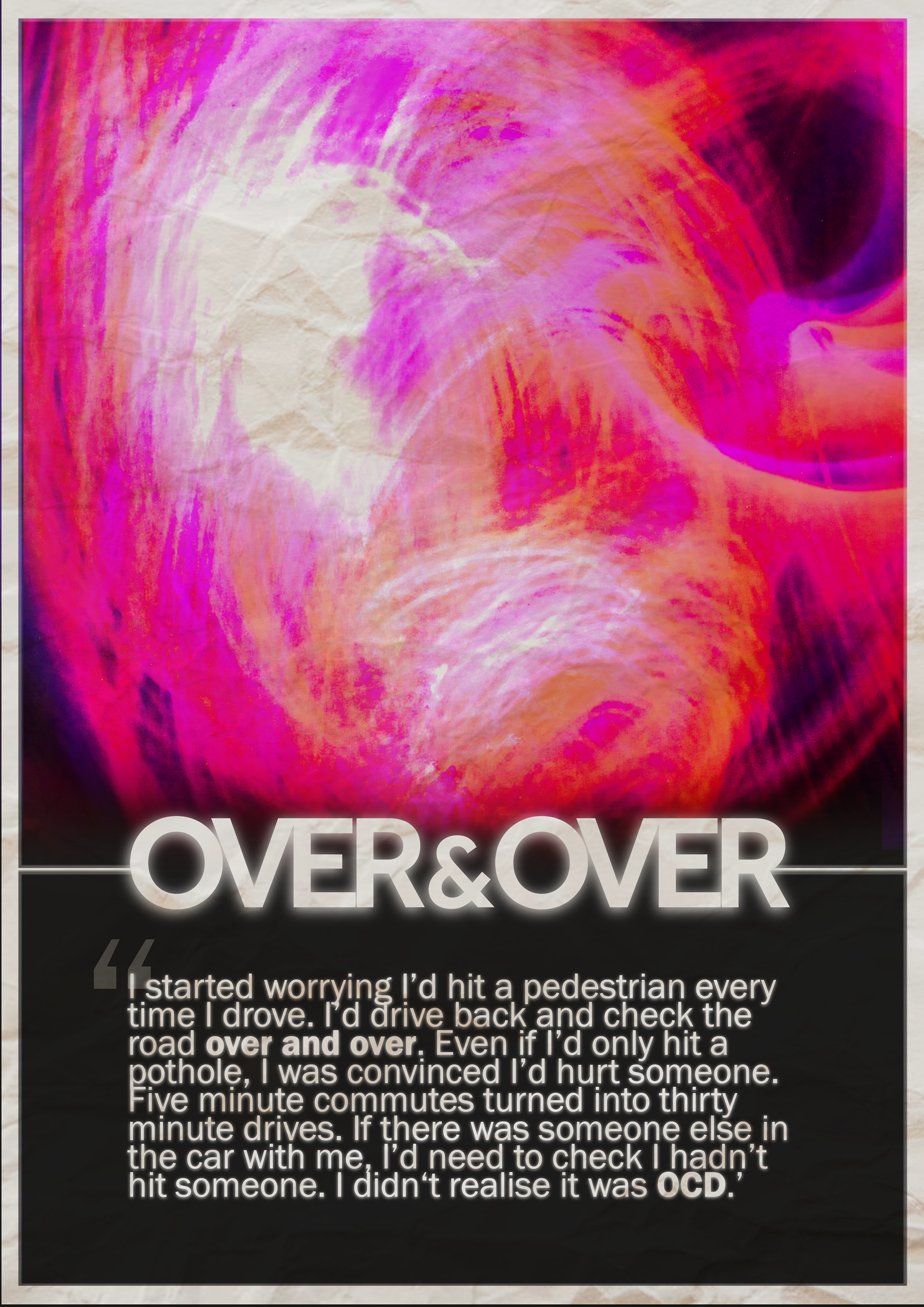
Blurred, indistinct pink, white and red lines that form a round shape.
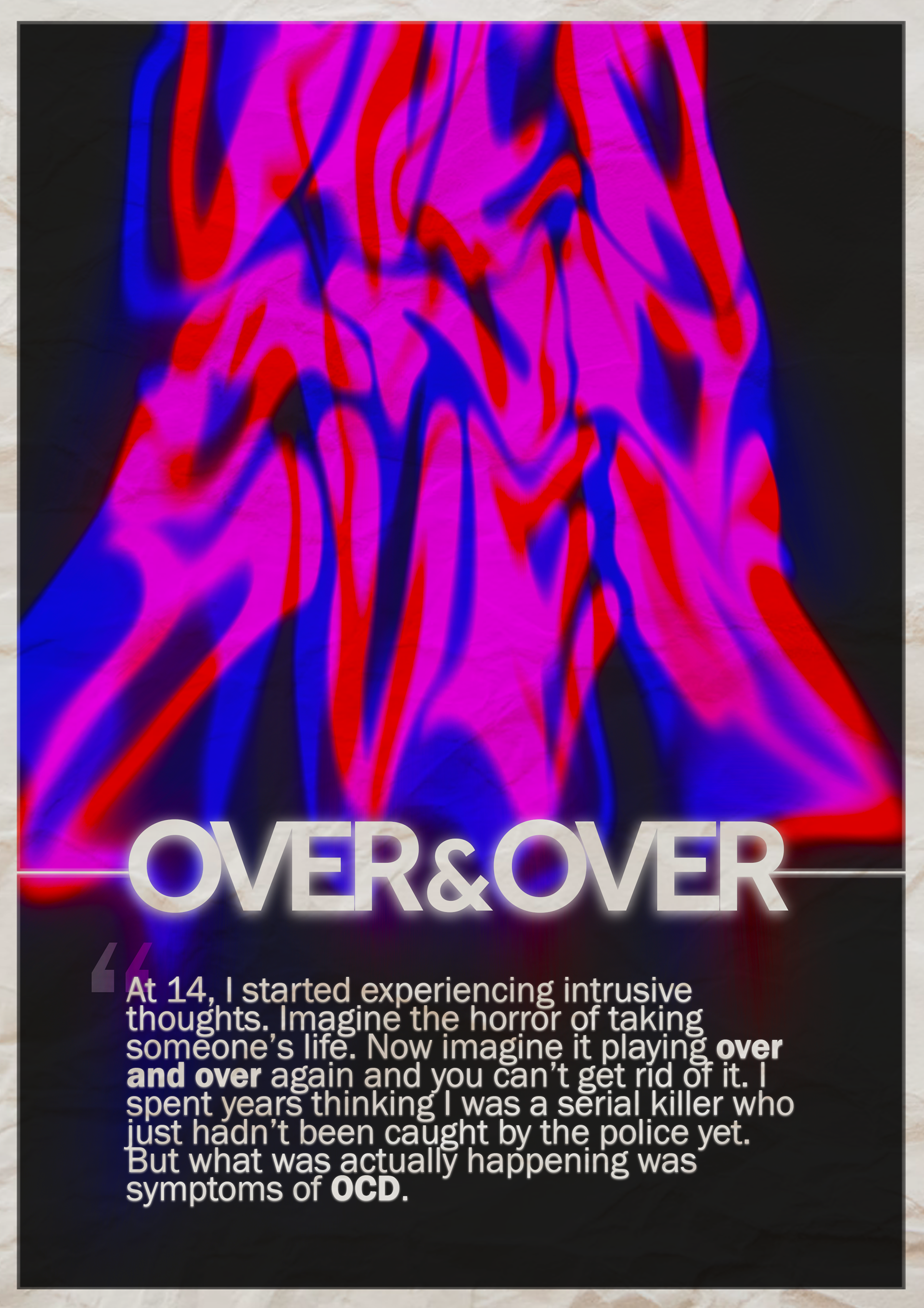
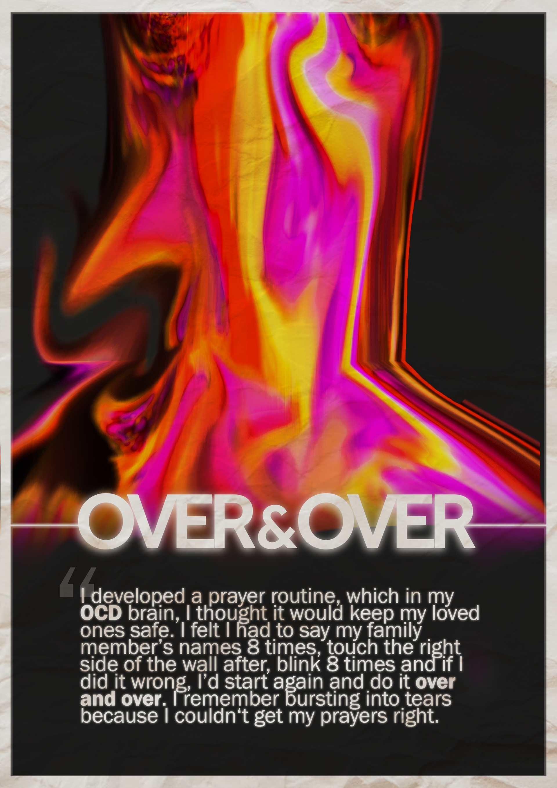
Warped red, blue and pink typography that resembles "Over & Over".
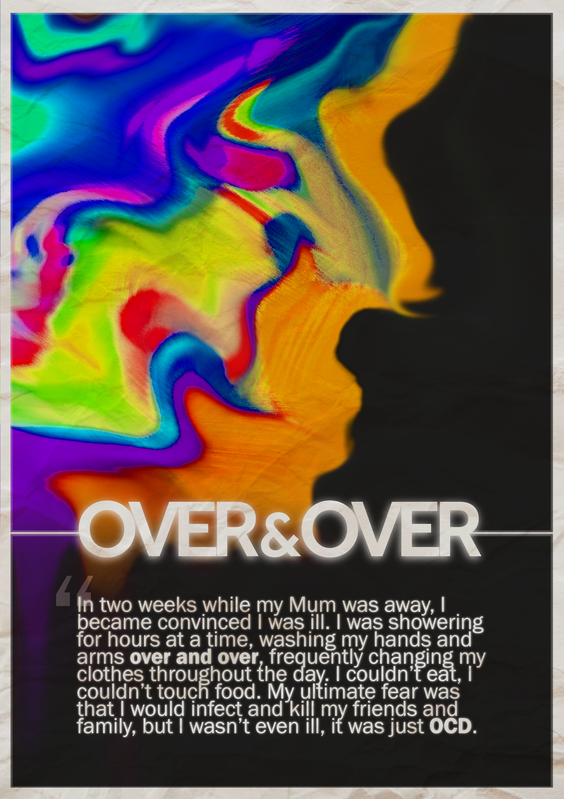
Layered vibrant colours smudged to form the side profile of a face.
WHAT THE PROJECT ACHIEVED...
Real Impact.
Improved understanding of OCD amongst parents and carers.
Storytelling.
Contributed to an accurate representation of OCD using authentic storytelling.
User-Journey.
Acted as a stepping stone for professional support.